
17 June 2021
Introduction
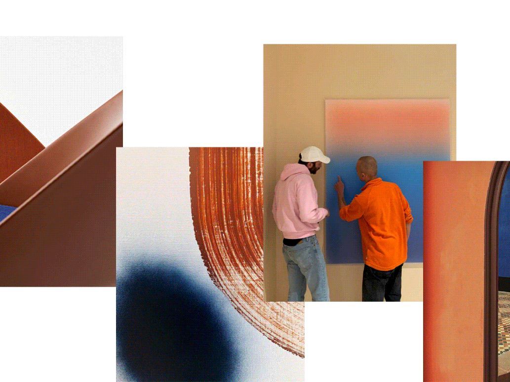
At Arper, color is more than a finish option or a singular design choice. Color – along with intuition, balance, light, play, and family – has evolved to be one of our core values. Over the years, we have collaborated with designers and thinkers who have brought their own color sensibility to our world. Here, we look at the ideas, designs, and designers who have helped shape Arper’s distinctive use of color and the concepts behind it.

Color In Context
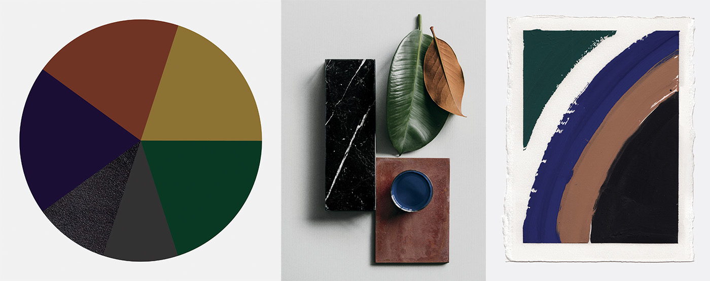
Color is not a static, fixed point. It does not act alone. In fact, color is just as much a reflection of our perception – cultural, historical, and material – as it is a single hue.
Color is a mirror to ever-changing cultural tastes. Modernism was almost afraid of color, believing that white cubes, black clothing and “neutral” palettes conveyed sophistication. By contrast, intense colors historically (and maybe even still) have been perceived as decorative or frivolous. But tastes change. The same color that was considered fresh and exciting in one moment in time could be considered drab in another era. Or, a color that signifies calm in one context could be considered depressing in another when seen through different cultural lenses. Color itself doesn’t change, but we do.
As much as culture and time affect how we perceive color emotionally, color also interacts with the personality of the object – its material, form, size, composition – and the changing conditions of its environment. The shine of silk, the deepness of velvet, the brilliance of enamel, or the matte powder of pigment – always the same color, but never the same effect.
Above all: one color is nothing. It never exists alone, independent from material, surrounding colors and historical and cultural signifiers. Like a piece of music, it is the combination of shades that creates an atmosphere. Color is constantly revealing itself.
“As designers, we try to find a form for something that’s already in the air – a wish, a mood, a vague, collective desire – but hasn’t found expression yet. We identify those tendencies and bring them into form through color, material, structure, and composition. In creating, we are in constant dialogue with our community: the way we express our values and ideas and react to the world we live in shapes our environment, and we are in turn shaped by our environment. In this way, we are all part of a big collective, thinking and feeling together.” — Jeannette Altherr
Color as Design Concept
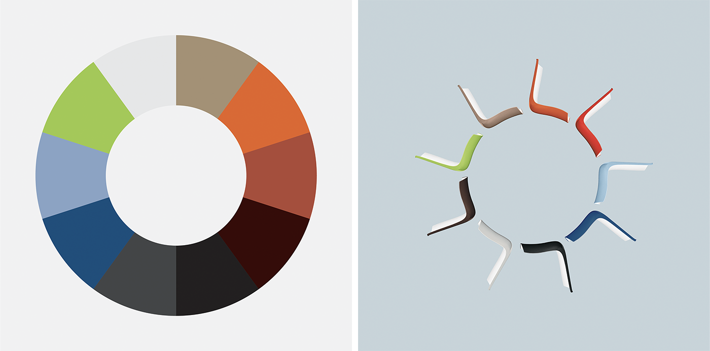
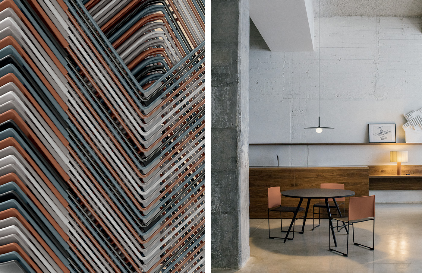
In 2000, the design for Catifa brought Arper’s philosophy of color into a new dimension. Created by Lievore Altherr Molina, the now iconic chair featured color not just as a finishing element, but as its central concept. The bicolor design for Catifa was created with a new bi-injection technology that allowed for two colors to be juxtaposed on the same body.
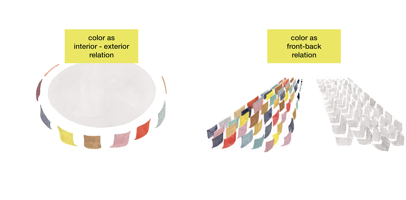
“The two-tone production creates a single visual identity between tables and chairs,” explained Jeannette Altherr of Lievore Altherr Molina. “Arranged around a light table, white chairs create a uniform environment designed for conversation and exchange. The external color shell or edge supports and protects collaboration and internal communication.”
The colors of the first Catifa collection were intended to be an active part of the interior design. The designers also played with texture: a glossy exterior combined with a slightly textured, matte interior meant even a completely white shell remained connected to the rest of the collection through slight shifts in color caused by different surfaces.
“In linear compositions, the two-colored chairs create a double effect: seen from the front, the rows convey serenity and clarity, as if sitting on a freshly laundered sheet. From behind, the colored backs create a vibrant and multifaceted surface, which captures the eye and the imagination." — Jeannette Altherr
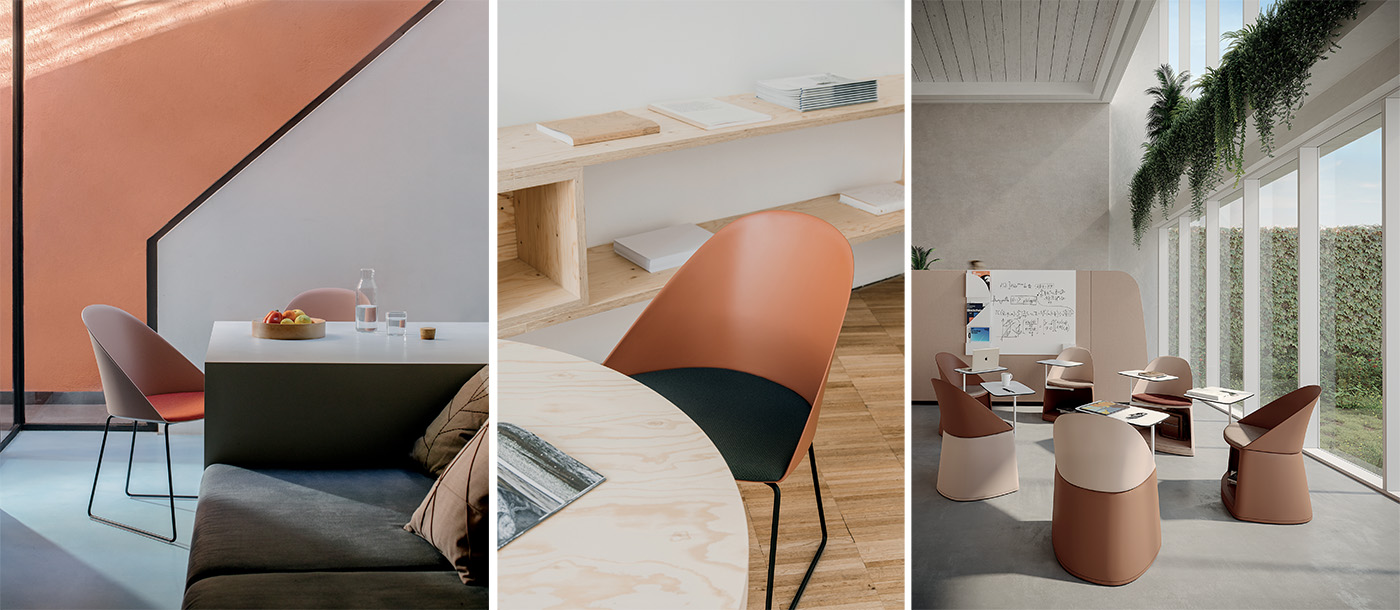
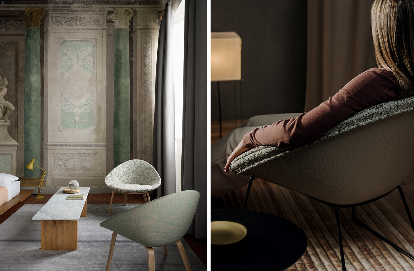
With the addition of new collections to the Catifa family, we saw how clearly color can define the personality of a product. In 2016, Arper celebrated the enduring potential of the Catifa family taking the bicolor customizations to a new level of contrast and color curation. Designer Jeannette Altherr chose a different color palette and material texture for each collection to distinguish its unique properties – the difference of scale and proportion within each collection had translated into a different gesture for each version.
Catifa 46 was released in fresh and playful colors while Catifa 53 was enriched with warm finishes and with leather versions, creating an elegant, refined look and more comfortable style.
Color and Space
When we think of color in architectural applications, we think of being enfolded in it in the same way nature can wrap around us: imagine the deep blue of the sea on a Greek island, the million shades of orange, red, and yellow in an autumn forest, or the ruddy earth tones of Sienna. Color at this scale has potential to be fully immersive and imprint deeply on how we feel.
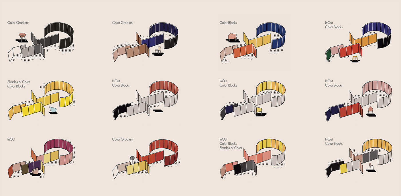
When designing Arper’s modular collections that create or define space -- like the panels of Paravan designed by Lievore Altherr in 2018 -- color was treated with an eye more towards the immersiveness of architecture than furniture.
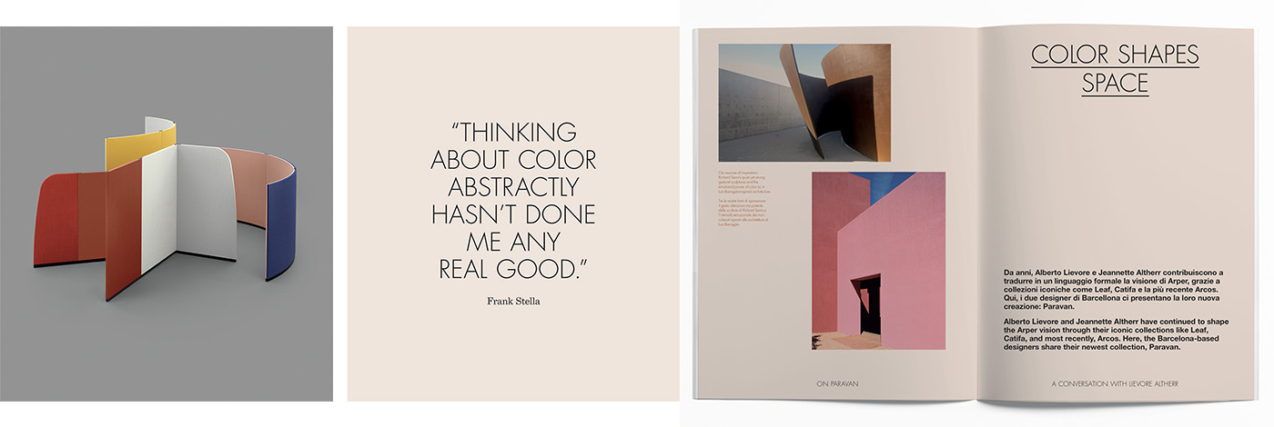
“Color is hue, surface, and its relation to shape – but it is also dimension, and its relation to a light and build context,” explains Jeannette Altherr. “It can seem easy to choose a color, but it is much more difficult to combine it with the furniture and the elements that make up architecture. For example, what works on a small scale like a chair might be too much when applied on a wall.”
While color in Paravan is enveloping, color can also function as an organizational element in in a room – a boundary to define the architecture of a space. With the configurations of Kiik designed by Iwasaki Design Studio or the modular sofa Loop, designed by Lievore Altherr Molina, color is used not like a field, but more like a horizon line – a navigation point to affirm structure.
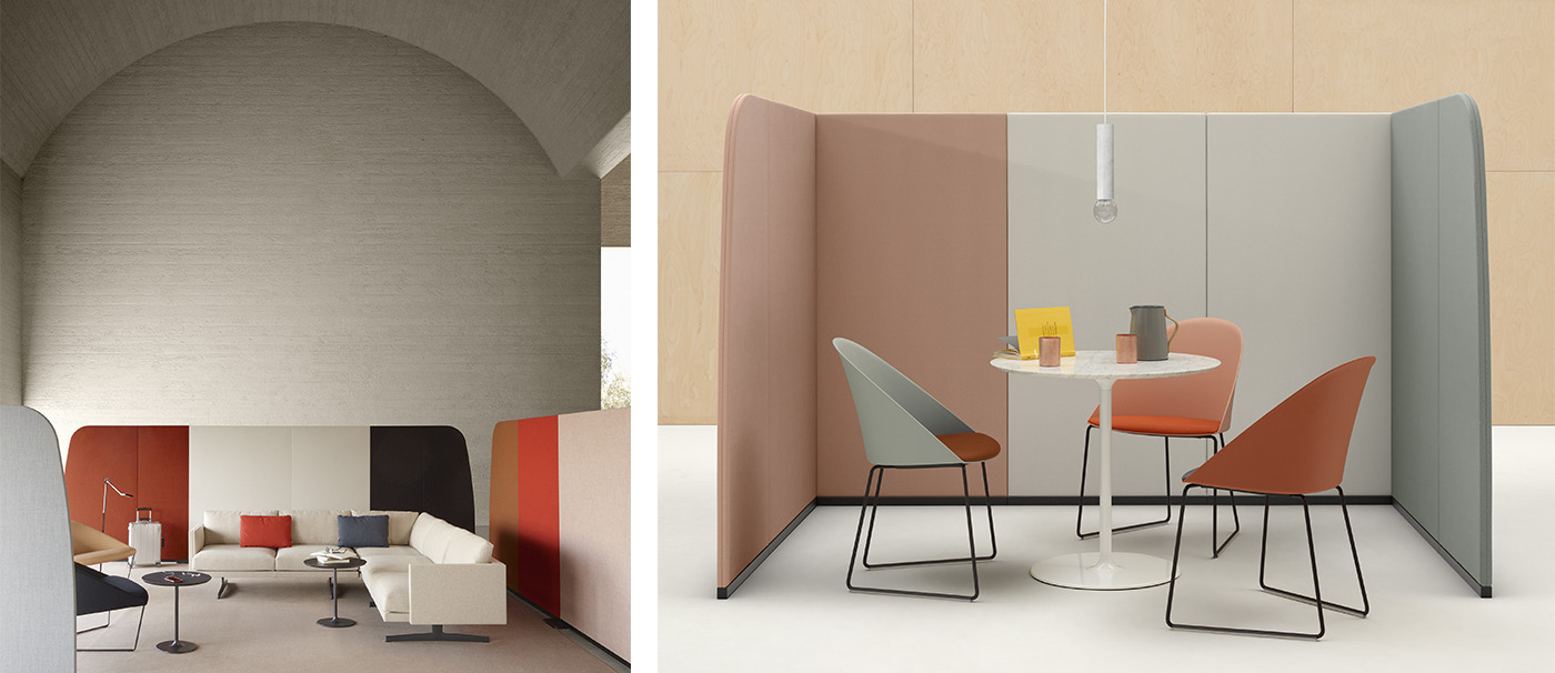
These applications of color at scale have the power to greatly impact our environments, and in turn, how we feel. These human-centered, softer spaces support our needs intuitively with materials and forms that feel good, and settings that awaken the senses. Environments that bring us together and put us at ease. To create this, color is crucial.
“Architecture was a great source of inspiration. Years ago, we were lucky enough to visit Luis Barragán's homes in Mexico City. We were impressed by the emotional strength of the color used for the walls -- really unusual colors like pink, yellow, bright red, blue. Incredibly, they were not perceived as artificial, but natural, due to the texture of the walls. The fabric -- the main material for a small architecture like Paravan -- can offer the same material sensation: structured, rich, warm." — Jeannette Altherr
Color and Emotion
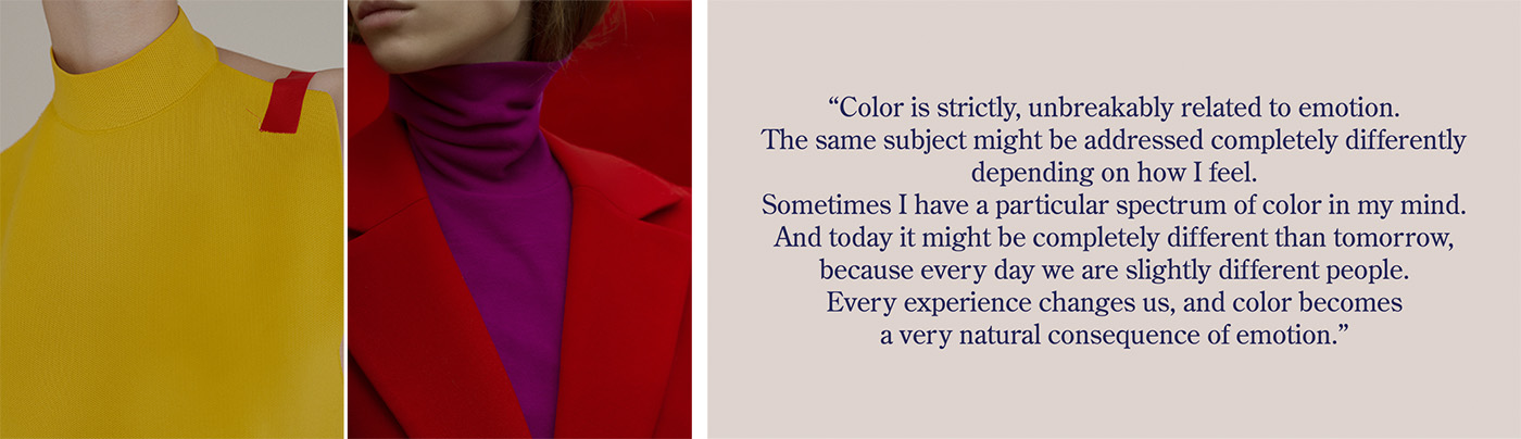
Color is emotion made visible. It not only creates personality in an object, it has a personality all its own. When we think of pink or blue certain connotations – and even emotions – arise. We understand the ties between color and emotion so deeply that, at times, color can even stand in for an emotion – think of Picasso’s melancholic “Blue Period” or of seeing life through an optimistic lens with rose-colored glasses. We effortlessly link color and emotion through language because color so effortlessly makes us feel.
Arper has always held color’s connection to emotion as one of its core design values, creating palettes for each collection that emphasize the ways in which color can form a dialogue with shape and material, while also considering how these interactions of color make us feel, and their adaptability into different design contexts. Out of our commitment to color as a core value, we have begun researching on the concept of color with collaborators across different fields.
Recently, we interviewed photographer Dominik Tarabanski about his growing body of work that explores the emotional connection to color. "In the end, what matters is the action that color exerts on us, what it does,” he shared. “If we are looking at a painting, an object or a chair, what impression does its color have on us? Does it work or not? Does it make us feel something, does it give shape to an impression of what we are seeing? It is not my intention to rediscover color, but to invite people to consider it more carefully.”
Writer and designer Ingrid Fetell Lee has a similar ambition in her work of asking her audience to be more in touch with the impact of their surroundings. The former design director at IDEO, Lee centers her work around the ways that aesthetics influence our emotions. “Emotional tenor affects a lot of the things we do,” she explains. “If these aesthetics really bring more joy, we become more affectionate, more open, more collaborative, creative, willing. So, how can we use our environments to help us get the best out of ourselves?”
Tarabanski and Lee, along with many other collaborators, have deepened our investigation into the connection between color and emotion – how our environments impact our feelings, and how design may contribute to that conversation.
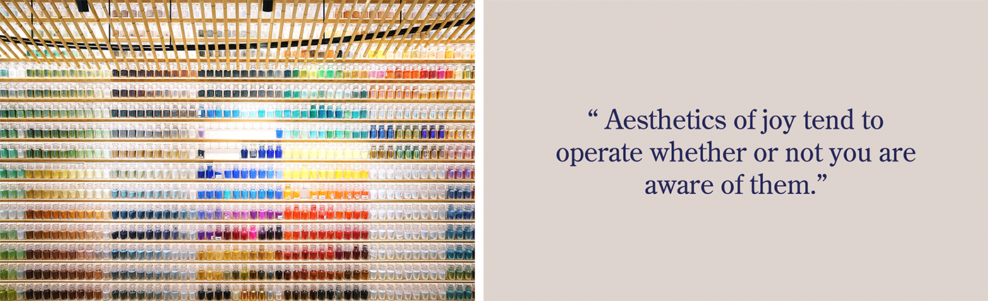
“I look at things that tend to be considered joyful: bright color, round shapes (hula hoops, merry go rounds, flowers). You can look at a scene or object and dissect it: why does that make me feel the way that it does? What innate joy circuit is it tapping somewhere in our brain? Generally speaking, aesthetics of joy tend to operate whether or not you are aware of them. People can say all day long that they love really jagged, angular furniture in their home, and that may be true. But just because they appreciate it and think it’s beautiful does not override the fact that those little pings are happening inside their brain and setting them on edge. My recommendation is that by adding some of these deeper, more universal aesthetics of joy in your life, you can replenish what is often missing in the built environment.”
— Ingrid Fetell Lee
Color and Wellbeing
Color can impact not only our mood, but our sense of wellbeing, too. Around 2014, the boundaries between life and work began to blur. A digital revolution was impacting every area of our life, but nowhere more so than in how and where we work.
The office had become not a static building or location that we traveled to, but rather, the digital tools we carry. The office was now anywhere our laptops or smartphones were: be it at home, an airport, a restaurant, or at the beach. And our offices were changing, too: more colorful, less functional, more intuitive and empathetic.
For Arper, this empathetic shift was the genesis of what we call soft tech: innovation and technology in the service of the body and mind, not technology purely for its own sake. We began to recognize that the quality of our spaces has an impact on everything – from health to productivity to creativity and collaboration. And, that the quality of our spaces defined not only by material and architecture, but by color.
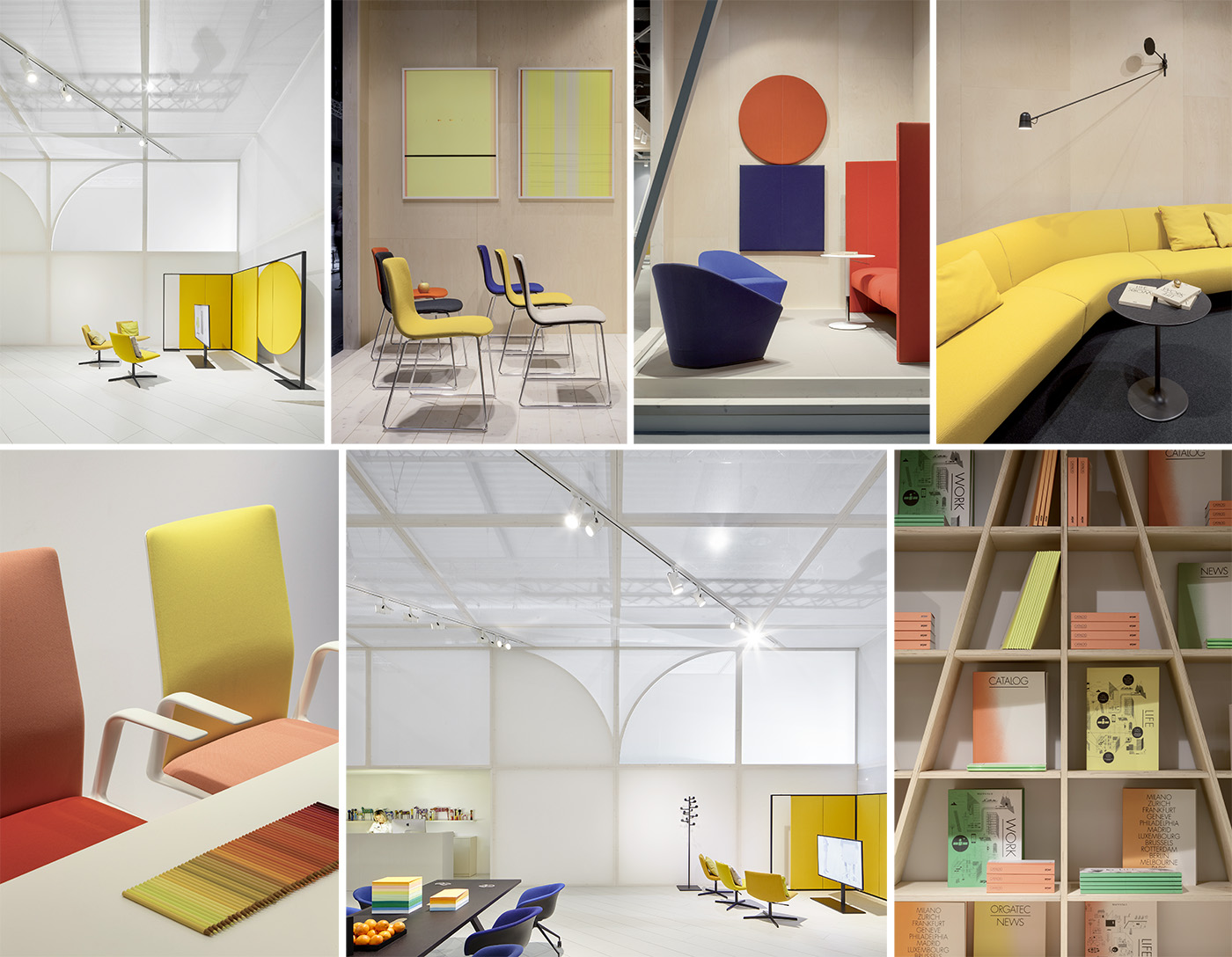
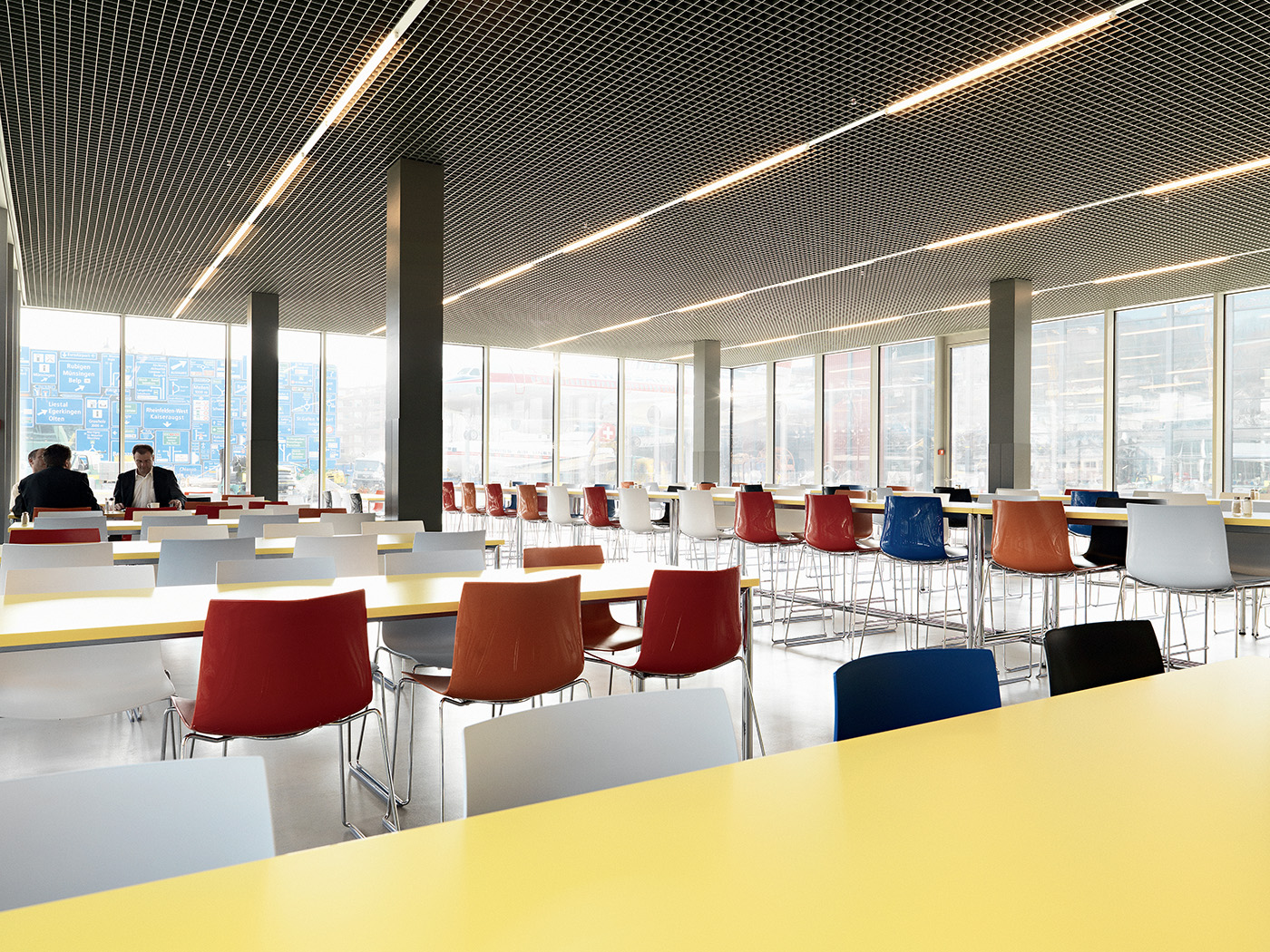
This softer approach was the inspiration for Kinesit. Created for the new offices and our new way of working, Kinesit featured strong, basic colors but used in a considered way (a palette later reprised in our booths for Oragtec in 2014 and the Milano Work booth in 2017). This palette explores and combines the nuances of primary colors situated in a bright, luminous environment to foster a joyful but sophisticated mood. Designed for an environment that was traditionally dominated by grey and black, Kinesit offered a sensuous, soft, and fresh palette alternative that was centered around wellbeing of both the body and mind.
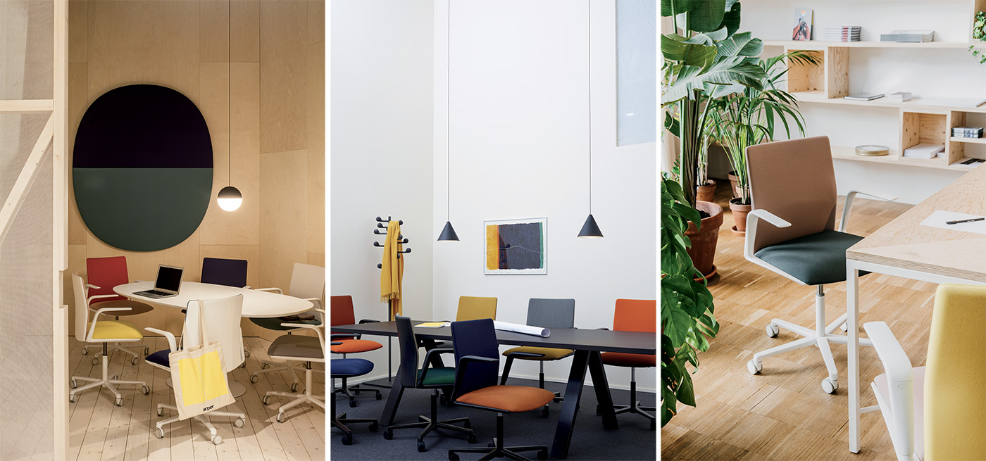
The interaction of body and mind was also the basis for Cila in 2017. Inspired by the image of layers of cloth enveloping the body, Cila’s silhouette of smooth lines retains a graphic character from its distinctive curve — the most essential symbol of shelter. Like being protected, like being held.
The colors of Cila’s plastic shell took inspiration in clay and skin colors – earthy, fluid, warm, organic – and were later used to exemplify the idea of Intuition in Arper’s booth design in 2018. Cila’s palette was complemented by materials that retained their tactile qualities: natural leather, soft wool, plastic, cast iron finish and a muted black color for base and black plastic.
In Cila, color and form translated into a consideration of wellbeing - here expressed as a slow wrapping gesture with a thick felt fabric, inspired in Josef Beuys felt sculptures.
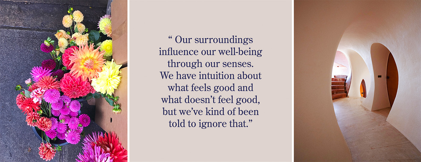
“We’ve been told – educated or convinced – that our relationship to our surroundings is an inside-out one. That we are supposed to express ourselves, make our mark on our surroundings. There is absolutely no discussion whatsoever of the reverse relationship, which from my perspective, is the much more important one. Our surroundings influence our wellbeing through our senses.”
— Ingrid Fetell Lee
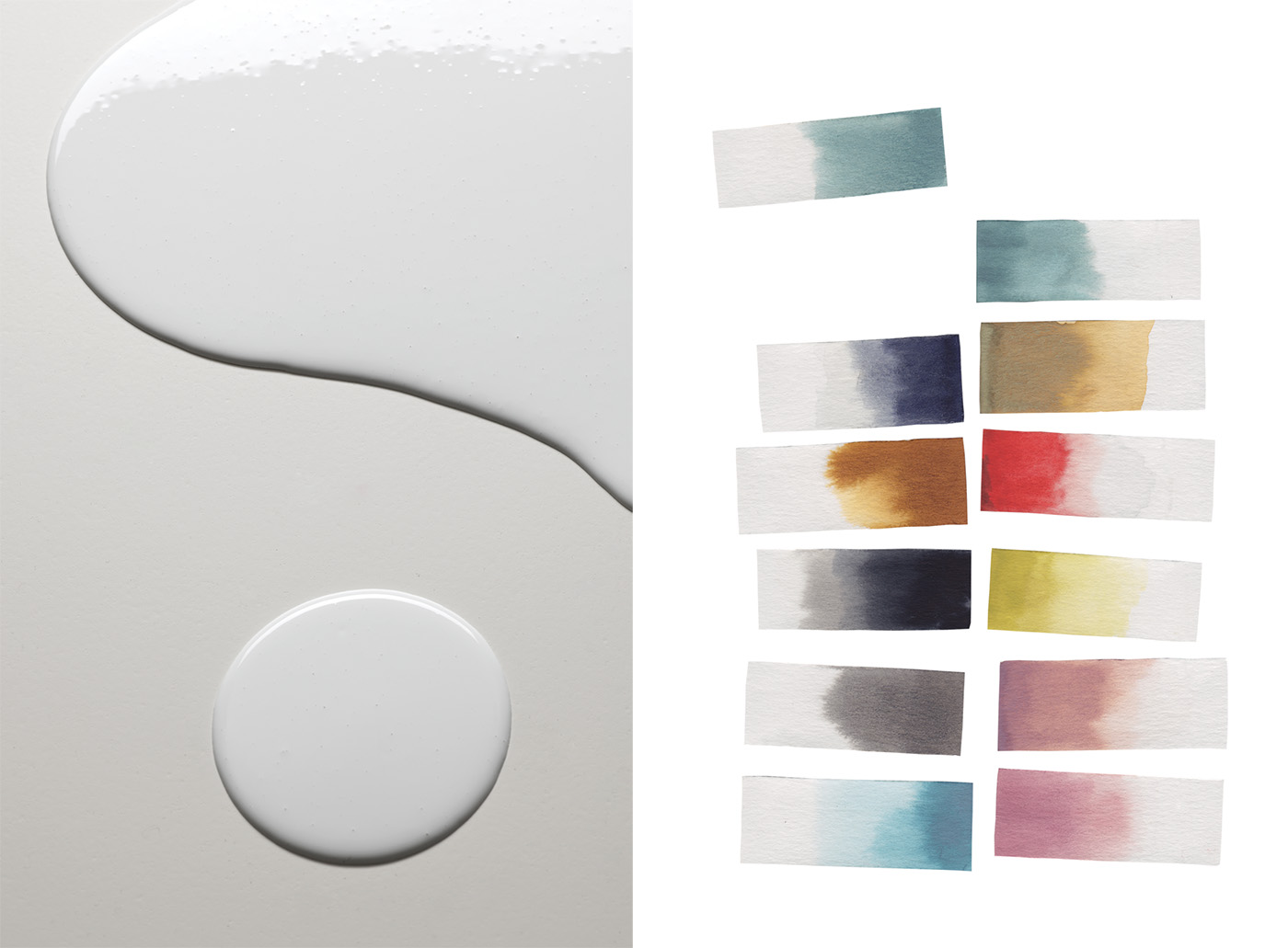
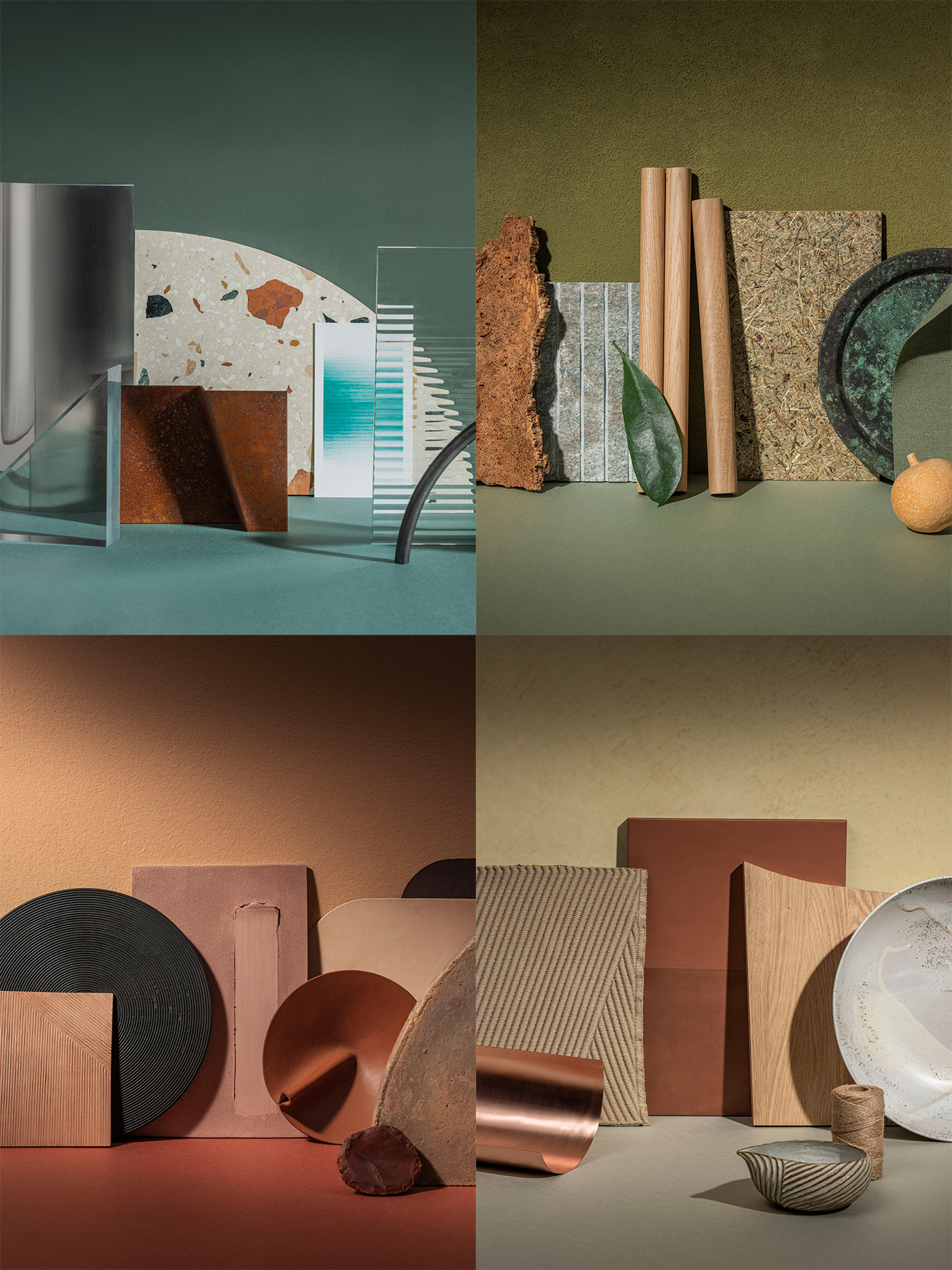
Color and Material
Material is closely related to color – and in some cases, color is material. Color is modulated by the qualities of material: its texture – matte, silky, shiny, rough, the natural color of the base material, and how it changes over time. The subtle nuances are an endless source of inspiration.
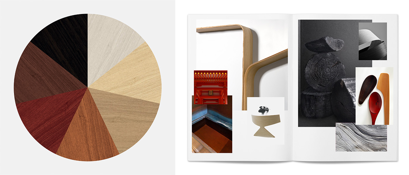
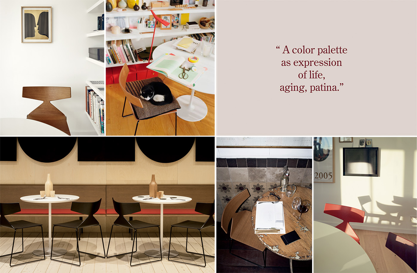
Arper began to explore inherent color changes of materiality in 2012 with Saya, Arper’s first wooden chair designed by Lievore Altherr Molina, and later with Aava in 2013, designed by Antti Kotilainen. Saya was created as an alternative to the long-living and unchanging synthetic plastics. The designers wanted to underline the living qualities of a natural material like wood; over time, its palette becomes an expression of life, aging, and the patina acquired by time.
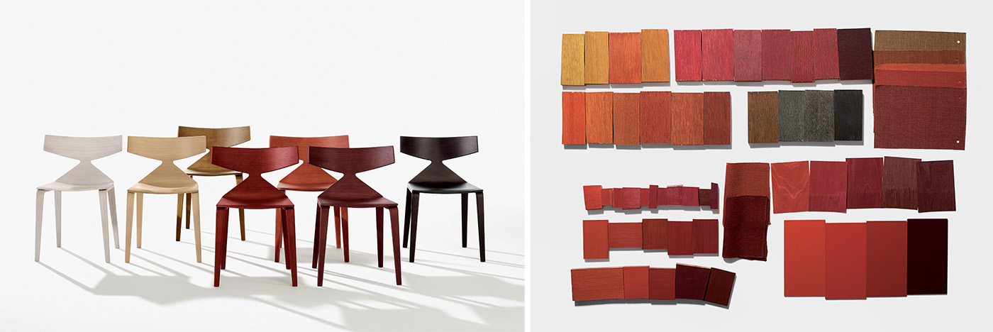
“The Inspiration [for Saya] came from a visit to Japan where I visited a manufacturer of tea containers done in steel, copper, and brass,” Jeannette Altherr of Lievore Altherr Molina explains. “The metal sheets are not sealed, therefore the touch of the hands and use over a long time gives a unique oxidation patina. Wood has a similar, lively quality. It represents time.”
With Saya, the designers chose a palette of natural vaneers with an open pore finish. Color and materiality were fused: “We chose colors in a gradient you can find naturally in wood, from a very pale, bleached tone, to toasted, up to a dark brown, almost black, like charcoal tone,” Altherr explains. “We included here also three different shades of red –– a color which suggests life, like wood, and is actually often used on wood in Japan. We imagine that one color can interpret a singular piece; several colors together can create a rhythmic pattern.”
Where Arper’s wooden pieces allow the materiality to create natural color over time, palette choices for architecturally-inspired collections like Arcos and Stacy reinforced the qualities of material through color selection. With Arcos, Lievore Altherr combined a repeated classical form with modern finishes inspired by dramatic material presence: velvet in rich colors like black marble, deep green, ink, rust, and ochre. Designer Jeannette Altherr explains:
“Special care was dedicated to the colors. Inspired by Corberò's house near Barcelona, we imagine the pieces in a monochrome finish like a shadow. We envisioned elegant, dark, velvet-like colors both in the upholstery and in the matte lacquer of the metal to suggest the idea that the piece is made of one single material. The rich palette of colors forms a graphic yet suggestive contrast against white walls, further poking our source of inspiration: The Corberò's house and the powerful visual archetype of geometry.”
Quiet and sophisticated, the modern stacking chair Stacy was designed in colors inspired by noble materials of architecture: brick, rust, cast iron, black steel, sandstone, and plaster. These color choices forged a relationship between color and material.
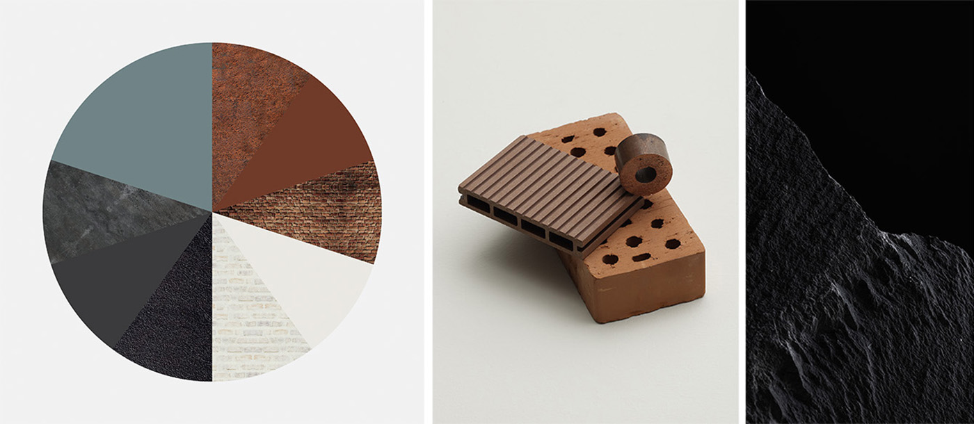
“Stacking chairs need to be very lightweight because are often moved around. The most lightweight options are done in plastic. We observed that most stacking chairs come in quite dynamic, lively colors – maybe because the big community spaces in which they are typically used are often made in basic materials that are easy to maintain, such as brick, white plaster, or plywood. Often, these spaces are not very nice, and the plastic colors are a way to cheer these spaces up. But there are only very few color options for lightweight plastic chairs meant to be used in quality spaces. So, we developed these colors in to have more of a presence.”
— Lievore Altherr
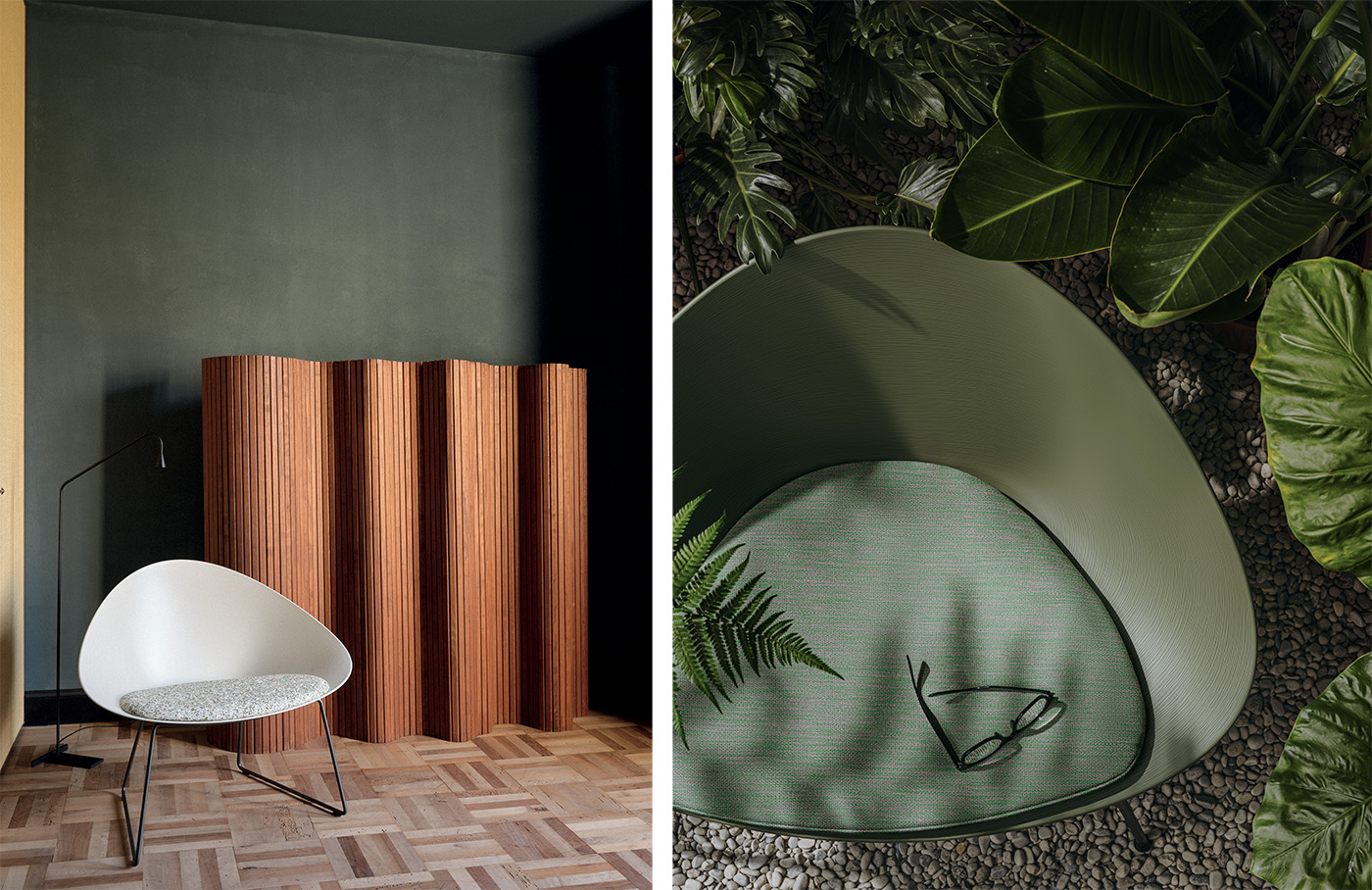
Color and Nature
While the Arcos and Stacy collections use color to reinforce material choices, Arper also became interested in the materiality of color itself through the work of collaborator Jennifer Brooke. Brooke is a design practitioner and researcher who studies – and creates with – the natural pigments found in the earth. In her practice, she forages for colors literally found under her feet, She refines these natural pigments into watercolors, chalk, and art materials to better understand the materiality of color and its relationship to place.
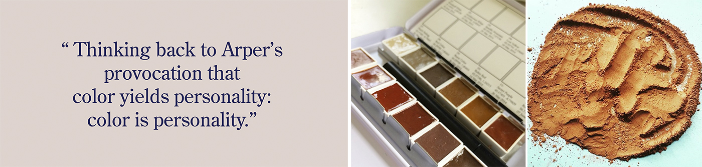
“When I started working with pigments as artist materials, and making watercolors or crayons or chalks out of them, I came to discover that each pigment behaved differently: some are buttery and velvety and a joy to work with, others take more time to open up,” Brooke explained. “They have bodies and personalities. Thinking back to Arper’s provocation that color yields personality: color is personality.”
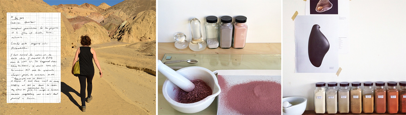
Brooke’s work underscores the relationship to color and how it behaves as a material, but it also raises questions about how designers and producers could come to think about the use of natural colors to aid in sustainability efforts in design. “Most people, when they talk about the color of the earth, think of earth tones, and earth tones have a very specific connotation, typically shades of brown,” Brook explains. “But, I know because I have earth in my studio that earth tones have an incredible range of color – from pinks to yellows to blues to greens. We are literally standing on a spinning ball of erotic, explosive color.”
While Brooke’s work quite literally unearths color in landscape, Arper began to be curious about color and nature in a different way: the connection to the land through color and materiality in design. With Adell, designed by Lievore + Altherr Désile Park in 2020, color selection mirrors the commitment to the natural world through the intermingling of color and material.
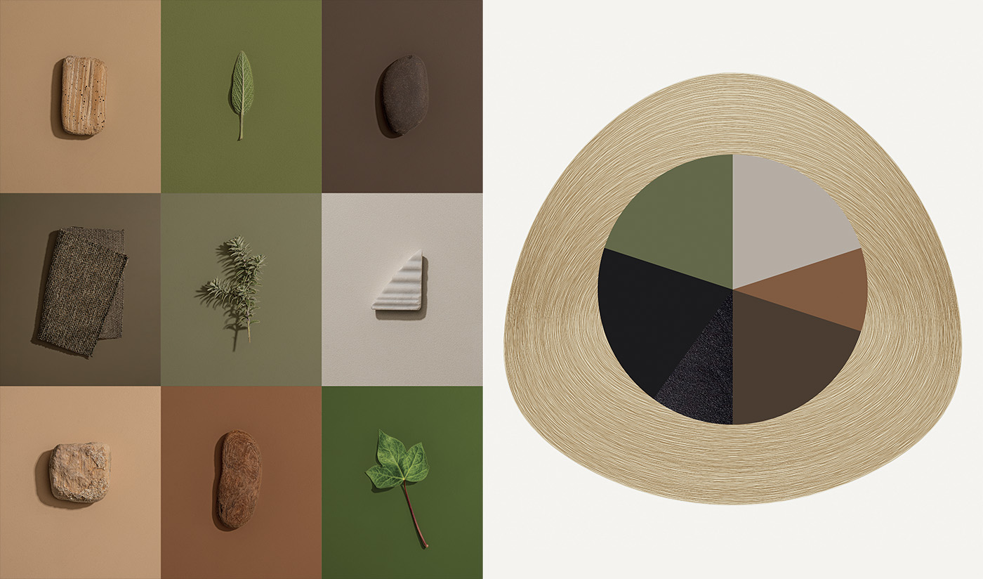
“We could not have imagined this organic shape and this natural tactility together with artificial colors such as optical white or bright and technical colors,” explains designer Jeannette Altherr. “We have developed a range of soft shades, inspired by natural materials such as wood and leaves. Even basic colors such as white and black are not purely graphic colors but a more delicate version of them: graphite black and ivory.”
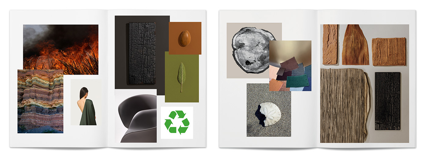
As we look to nature for color inspiration, we also look to our production methods to protect the natural world. Adell is made of post-industrial recycled plastic. Because of its material, its smooth lines connote a pebble, its finish suggests the concentric motifs of the rings in a tree trunk and recalls the tactile qualities of the natural world, evoking the ease and beauty of nature. As producers and as individuals who are part of the community, design reflects the need for a less conflicted connection to the planet.
As ever, color is as much a commentary on the materials we use as the time we live in. With Adell, and future collections releasing in 2021, Arper is exploring the many ways the color can be used not only as a design element, but the ways in which design can be used as a sustainability effort as we explore the future of color.
Color and Sustainability
For Arper, what is produced has always been as important as how it is produced. It is not enough for objects to be beautiful – they must also be made with consideration for their impact on the health of society and the environment. For Arper, sustainability in every aspect of design – from material sourcing to production practices to even the use of color – is not a secondary consideration, but rather a central concern in the creation of every collection.
“As companies, we have a social responsibility for sustainability that we simply cannot overlook,” explains Arper Chairman Claudio Feltrin. “In 2005, we set up a special team within the company focusing specifically on sustainability. As an organization that produces, we focused on the aspects that have the greatest impact on the ecosystem, including the way we select materials, our production processes and how we handle the final stage of the product lifestyle. In time, these tools grew into guidelines and became a set part of our processes – a reflection of our belief that sustainability is a process that requires constant effort and attention over time.”
Arper’s circular perspective on the production and life cycle of a design begins with the origin of materials. Can the designer’s vision be completed in with a low-pesticide use material like help or algae over a water- and pesticide-intensive cotton? Is it possible for the design to be created using recycled plastic? These questions extend into the consideration of color.<br /> <br /> Most color processes that alter the natural color of a material have a profoundly negative effect on the environment. Textile color treatments like bleaching and dyeing create 20-percent of all fresh water pollution. Natural plant dyes provide a safer alternative to chemical dyes in terms of pollutants, but do not provide sufficient colorfastness to support the demands of the contract industry.
What can design thinking contribute to the challenge of color and sustainability? What role can designers play in shifting our ideas of beauty? Arper Chairman Claudio Feltrin thinks that Design Strategies can contribute solutions: “Design can explore ways of innovating and redefining aesthetic values to ensure that what is ‘good’ for the environment and human beings is seen as ‘beautiful’ and ‘desirable.”
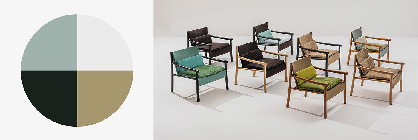
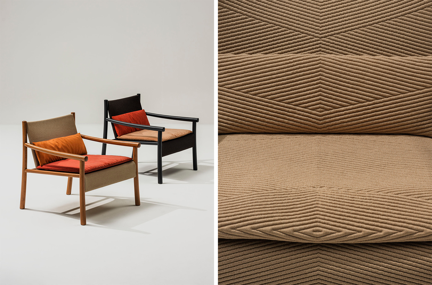
Beyond offering customizable upholstery finishes in sustainably-produced fabrics in myriad colors, Arper has begun to consider color in new ways. With the 2021 Kata Collection, Altherr Désile Park explored new strategies for sustainability.
By creating a cushion produced by 3D knit and made from post-consumer polyester, the overall textile waste was reduced by 30- to 50-percent. The need for additional chemical dye processes was reduced by incorporating texture and pattern into the 3D knit, creating two different patterns that animate the surface with light and shadows created by a relief in graphic shapes.
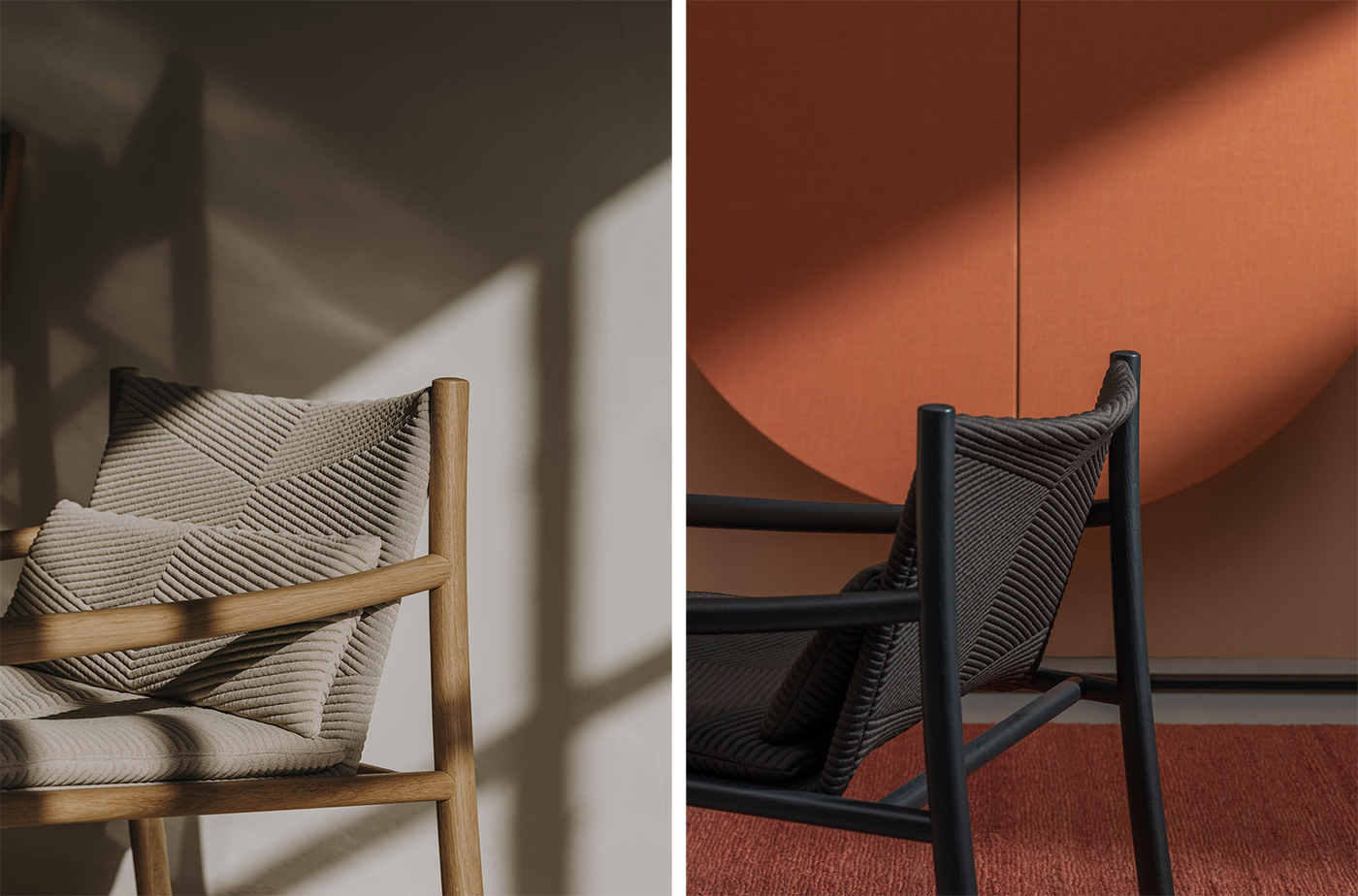
“On one hand we explored how to find strategies other than combining colors to animate a space,” explains designer Jeannette Altherr of Altherr Désile Park. “For the new Kata Collection, we developed four basic natural colors: charcoal and linen – which use no additional dye – and wheat and water. We felt there was less need for expressive colors when you have other ways to make an interesting surface. You can then use colors just in small doses, like on one cushion. ”
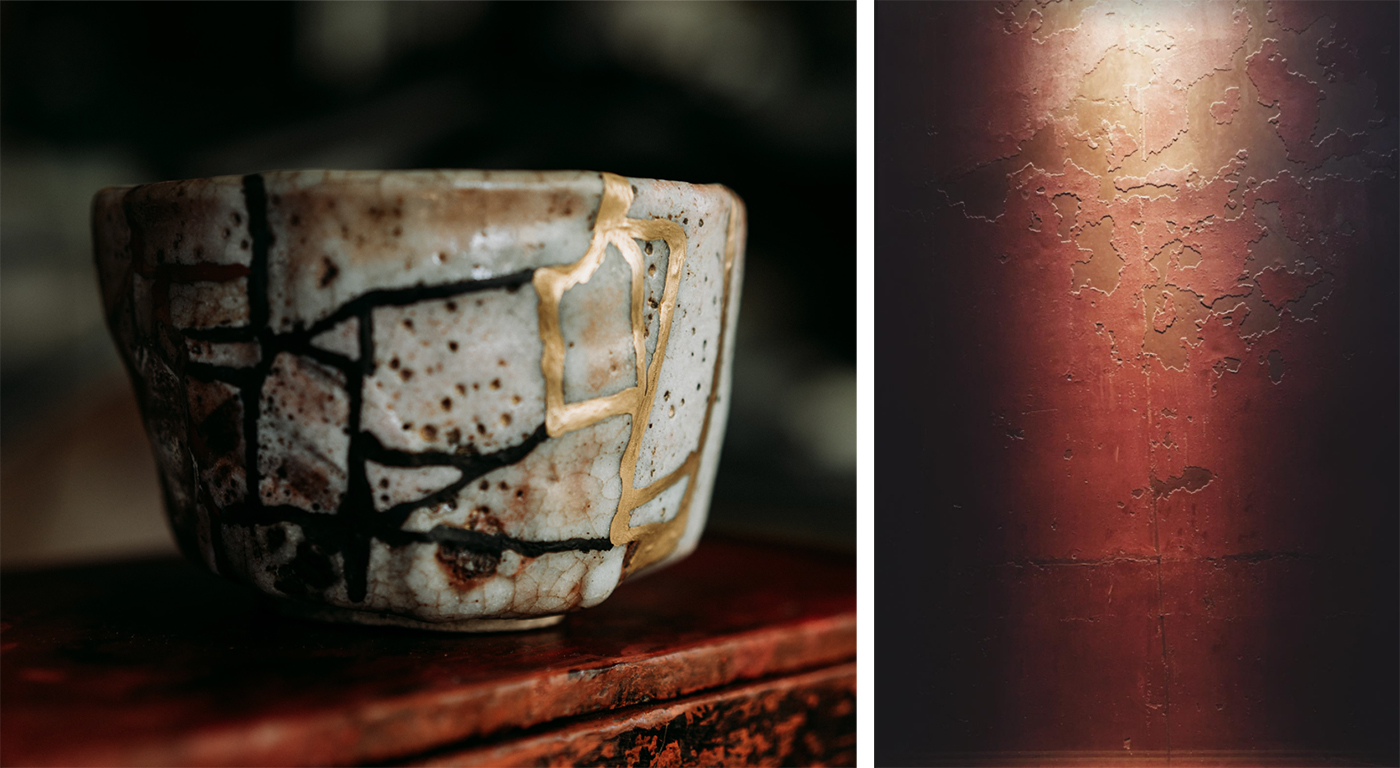
Another possible design solution is to reconsider how we view patina and the impact of time on color to be able to broaden the design vocabulary of color processes. “The patina of a well worn pair of jeans adds an appeal that a new pair doesn’t have,” explains Altherr. “Collectors are particulary attracted to the patina of second hand furniture. A scar of repair like the Kintsugi technique of repairing broken ceramics or the restoration project undertaken by David Chipperfield at the Neue Museum in Berlin can become something even more beautiful or unique. The question remains: In a world on the brink of a climate crisis, how can we change our aesthetic vales to support our sustainablity efforts?”
Sustainable use of color does not mean limiting our palettes, but rather opening our minds to the full spectrum of colors and possibilities that can arrive through design solutions. Only then will be fully be able to understand the true future of color.