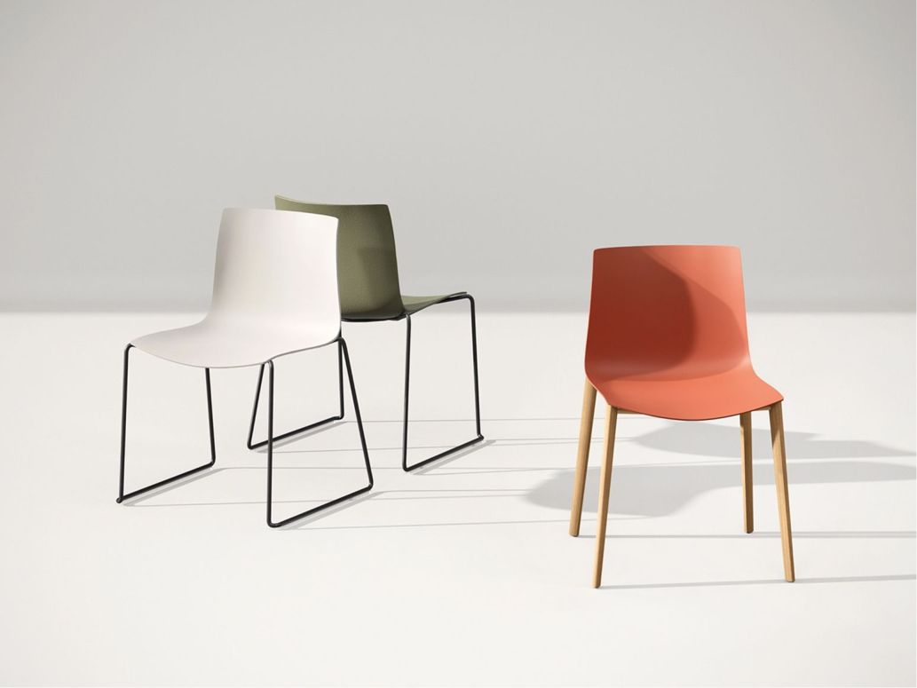
Color in architecture and design

08 aprile 2021

Arper e Guggenheim - Manolo De Giorgi

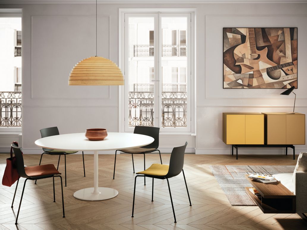
Our five-episode series “Color: a journey through art and design" continues with the fourth episode dedicated to “Color in architecture and design – part I”.

After the first three episodes developed together with the Peggy Guggenheim Collection and dedicated to the role of colors in art, Manolo De Giorgi – architect and design expert – will explain the approach to colors in the post-war period, with a specific focus on how red, orange, yellow and pink colors were applied. 

Université Paris-Sorbonne Centre de ClignancourtUniversité Paris-Sorbonne Centre de Clignancourt, © 11H45

Is there any difference between the colors used in the 30s and the colors used in the post-war period? Who were the first designers to introduce colors in industrial products?  And why are red, orange, yellow and pink so relevant for the Italian design?

Do not miss this episode!

Next episode to come:
19th April, Color in architecture and design – part II

Wir Bleiben
in Kontakt!
Informationen zu Produkten, Events,
Geschichten und anderen Neuheiten für Sie.

Lassen Sie sich von der neuen App von Arper inspirieren

Laden Sie die App auf Ihr Tablet herunter und erkunden Sie unsere Welt auf vollkommen neue Art!